Here's a nasty issue I notice a while ago but never had time to fix... until today! If you've stumbled upon this post, it most likely mean that you're in the same shoes as I was, hence there's a good chance you'll find the following lines useful enough.
As you might already know, Crayon Syntax Highlighter is one of the best syntax highlighting plugins available for WordPress: it supports a lot of customizable languages and themes, has a nice interface, and we used it in this blog since the day one... way before the AMP Project landed.
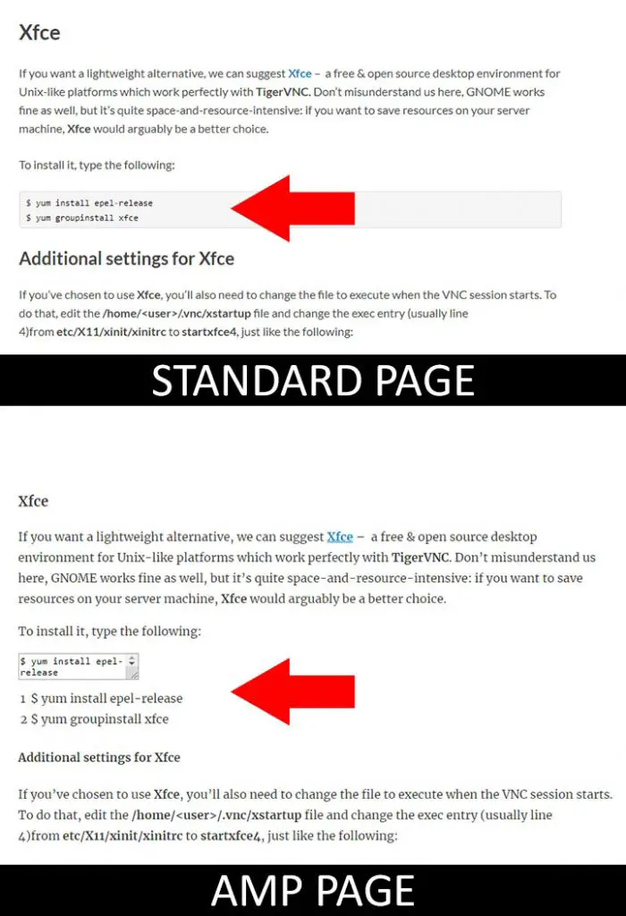
Unfortunately, the plugin performs really bad on AMP pages, as the following screenshot clearly shows:
Pretty sad, isn't it?
Well, luckily enough, I was able to find a neat way to avoid this - and turn such uglyness to something decent - thanks to this StackOverflow thread.
In very short words, you have two way to get out of this mess:
#1: Disable the Plain Code View
Go to the the plugin settings page (Settings > Crayon), then navigate to General > Code section and turn off the Enable plain code view and display option: this will get rid of that ugly textbox within the AMP pages. The good thing about this workaround is that it's dead simple to pull off; however, it comes with a major flaw: since you will disable the plain code view on non-AMP pages as well, you'll lose some functionality there - the "copy" button and the "switch to code view" feature.
#2: AMP Action Hook
If you're using the "official" AMP plugin for WordPress, you can use the great css action hook it provides to programmatically add some CSS styles for AMP pages only.
In order to do that, go to WP Admin > Appearance > Editor and add the following lines to your theme's functions.php file:
|
1 2 3 4 5 6 |
/* Fix Crayon Syntax Highlighter in AMP pages - www.ryadel.com */ add_action( 'amp_post_template_css', function() { echo '.crayon-plain-wrap { display: none; }'; echo '.crayon-nums { visibility: hidden; }'; echo '.crayon-main { font-family: monospace; font-size: 1.2em; background-color: #efefef; }'; }); |
Once done, refresh your cache plugin and/or proxy cache (if you use one) and reload the AMP page. You should be able to see something like this:
Much better, right?
Needless to say, you can customize your CSS styles even further to match your tastes.
#3: Custom CSS
If you're using a different AMP plugin - such as AMP for WP, All in One SEO Pack and so on - you will need to use the action hook provided by that plugin: you'll probably find it by looking at the plugin official documentation. In the unlikely case it doesn't provide any relevant hooks, you can also put the CSS styles within the "custom styles", "custom HTML" or any other custom content supported by the plugin - as long as it will be rendered on AMP pages only.
|
1 2 3 4 5 6 7 8 9 10 11 12 13 |
.crayon-plain-wrap { display: none; } .crayon-nums { visibility: hidden; } .crayon-main { font-family: monospace; font-size: 1.2em; background-color: #efefef; } |
Conclusion
That's it! I hope that this post will help other developers who are struggling about this issue.
If you have other issues with the Crayon Syntax Highlighter together with other plugins, such as the TinyMCE Advanced plugin, check out this other post.


